Anna Peter
Work
About
Resume
Design System - ABG Weave
CASE STUDY

INTRODUCTION
This case study showcases the development of the Design System at Adamsbridge, aimed at standardizing the product’s design and providing engineers with reusable components to improve workflow velocity.
When I joined Adamsbridge in July 2023 as one of three in-house designers, the company was ready for a more cohesive design approach. With no design system in place, we set out to create a solution that aligned the design and development teams, streamlined collaboration, and enhanced the user experience.
MY ROLE
Responsible for research, UX/UI Design, User testing, Design system maintenance, Accessibility Design
THE TEAM
3 designers, 1 product manager, 1 developer
TIMELINE
Initial Setup : August 2023
Maintenance : August 2023 - Present
THE PROCESS
Discover
Identifying the need
Research
Gathering insights
Strategize
Prioritizing and Planning
Design
Crafting solutions
Develop
Executing the blue print
I. DISCOVER
WHY DID WE NEED A DESIGN SYSTEM ?
Despite having developed a full SaaS platform, our design efforts were fragmented. Each new project required us to design components from scratch, leading to inconsistent user interfaces, inefficient workflows, and misalignment between designers and developers.
As we transitioned existing products to cloud-based solutions and with new products in line, the lack of a shared design system became more apparent. This created friction across teams, as there were no established guidelines or reusable components. Each team operated in isolation, resulting in inconsistencies that undermined the user experience and created a significant maintenance burden.

Before the design system: A scattered design, where buttons, fonts, and components varied unpredictably, creating a fragmented user experience.


Lack of flexibility
A clear hierarchy for design components was missing, making it a challenge to maintain a coherent design language and leaving us feeling overwhelmed and slow to adapt as new products and features rolled in.

Communication gaps
The lack of a centralized design system led to fragmented communication among teams, with each designer interpreting guidelines in their own way, creating a ripple effect of inconsistencies.

Duplication of effort
Without a component library, us and our developers found themselves repeatedly reinventing the wheel for similar components across projects, leading to inefficiencies that slowed progress.

Inconsistency
Our platform resembled a patchwork quilt, where buttons, fonts, and component states varied wildly, leading users through a disjointed experience that left them puzzled rather than guided.

Accessibility Challenges
Our products needed to be inclusive for all users, including those with visual, auditory, or motor impairments. However, the inconsistent application of accessibility standards across projects felt like a barrier, making it challenging to ensure compliance and truly serve everyone.
II. RESEARCH
At the start of this project, I had a general understanding of what a design system entailed, but I knew I needed to dive deeper to build one from the ground up for a complex, evolving web application. Since this was my first time tackling such a task, I immersed myself in research, exploring design guidelines from giants like Google Material Design, Carbon Design System, and more. These insights expanded my understanding and gave me the direction I needed to shape the system from the ground up.
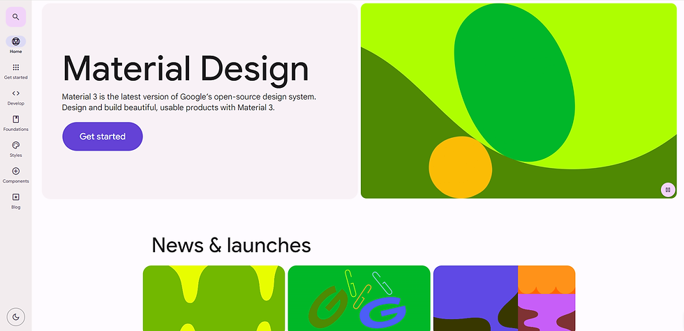
Google Material Design helped me understand the states of buttons, input fields, and other UI elements, providing clear guidelines for interaction design.

IBM's Carbon Design System helped me structure and align our design system components,
ensuring consistency and clarity.
I approached the research with key questions in mind, focusing on identifying the core elements needed to build an effective design system.
Primary users are those who directly interact with the design system to design and develop product interfaces.
Secondary users are the ones who may not design or develop directly, yet depend on the system to uphold consistency and alignment in their line of work. (Product Owner/Managers, QA Team, Marketing Team etc).
-
Who will be the users of this design system?

Designers
Designers rely on the design system to keep their work consistent, save time, and ensure it aligns with the product’s visual and interaction patterns.

Developers
Developers turn to the design system as their blueprint, utilizing reusable UI components and guidelines to create cohesive user experiences.
UNPACKING FOUNDATIONAL QUESTIONS:
What frameworks and technologies does the design system need to support?
How can we create a system that's both modular and scalable to support future growth?
What is a reusable components library?
How do design systems and component libraries drives cost savings and efficiency?
How will the components be documented for easy reference and adoption?


To align the design system with our Angular-based architecture, we developed a modular framework built around reusable components and design tokens. This approach ensures consistency across projects while supporting scalability as new features are added.
Comprehensive documentation, hosted in Storybook, provides clear guidelines, examples, and code snippets for easy adoption by designers and developers alike. By reducing duplication and leveraging standardization, we significantly improved efficiency, allowing teams to focus on innovation rather than repetitive tasks.
III. STRATEGIZE : FOR EFFICIENCY
With a tight three-week timeline, I prioritized establishing clear guidelines for spacing, colors, and typography to lay a strong foundation for the design system. This approach ensured the system was not only organized and cohesive but also scalable, allowing for efficient implementation and future growth.
IV. DESIGN : BEGINNING THE DESIGN PROCESS
Working closely with the Head of Product, I made user research our guiding star. By integrating insights from usability studies and discovery exercises, we laid a solid foundation for our component library and interaction patterns that shaped the effectiveness of our Design System.
Consolidating colors and typography
To tackle the confusion around our color usage, I organized our brand colors into a clear hierarchy. By categorizing them into primary, secondary, neutral, and semantic colors, I established a clear framework for usage with tokens designated.
This approach not only clarified when and where each color should be applied but also allowed for flexibility with tints and shades. Alongside colors, I established a set of typographic styles with proper tokens to bring cohesion across our designs, keeping usage clear and intuitive for the whole team.


Color Palette with all variables
Typography with all variables
Accessibility Integration: We approached design with an inclusive mindset, ensuring no one was left behind. We focused on color contrast, font sizes, and mobile touch targets, all while racing against the clock. Despite the pressure, our commitment to inclusivity remained strong, ensuring every component was usable for everyone, across all platforms. We did a solid job, but there’s always room for improvement—because design should be welcoming for all!

Grid system for web, mobile and tablet screens
Defining a grid system
Creating a responsive grid was essential for our design, as our layouts varied greatly. We created a series of grid combinations tailored to different layouts, like adaptive columns for left-hand navigation pages, specific grids for card-based dashboards, and flexible structures for table-heavy designs. This approach provided the right balance between flexibility and structure across different content types.
Crafting a component system
We began with a blank slate, applying Atomic Design principles to structure the interface. Starting small—with icons, buttons, and form inputs—we built a system that grew layer by layer. As these building blocks came together, patterns emerged, creating a system that was adaptable, scalable, and ready to evolve with our needs.
ATOMS


MOLECULES

ORGANISMS


High-quality documentation is essential for any design system, especially for newbies. We developed comprehensive guides for every component, ensuring they were organized, consistent, and user-friendly. Inspired by established systems like Material Design, we included best practices and tools to ensure anyone stepping in would feel right at home - no newcomers left behind!
V. DEVELOP
Finalizing the design system
Once the figma components got the green light, they moved into a shared components file, making it a snap for the team to drag and drop assets into their designs. I gave everything a final check to ensure it aligned with our latest guidelines, tweaking the color palette for a polished look. With the design system and documentation wrapped up, we handed them off to the development team, where an engineer brought the components to life in Storybook. This setup didn’t just finish our project; it paved the way for future redesigns, making design reviews a whole lot smoother during updates.

EVALUATION

Development Impact & Collaboration
The design system created a common language that brought designers and developers onto the same page. Instead of getting bogged down with nitty-gritty details like spacing or color, we could focus on the bigger picture—building great features. The handoff between teams became smoother, cutting out confusion and making the whole process more efficient.

Design Efficiency
With our library of ready-to-use components, creating high-fidelity interfaces that once took days was now wrapped up in just a few hours. This newfound speed let us iterate quickly, refining our designs and keeping everything consistent across the product.

Experimentation and Prototyping
The design system transformed our approach to experimentation. We could quickly build prototypes and test new ideas, making it easy to evaluate our hypotheses. This allowed us to create more variations for A/B testing, helping the team iterate and innovate with confidence.

Communication and Alignment
To keep the team synced up, we set up a dedicated Teams group for real-time updates on component changes and aligned the Design System with the developer's Storybook to ensure consistency. Additionally, We used Figma handovers with detailed interaction notes to reduce meetings and keep the team aligned.
WHAT I LEARNED
The work continues....
Building the design system wasn’t easy, but it shifted how I think about design. Balancing design with development showed me that a solid system doesn’t just make things run smoother—it actually strengthens creativity and brings the team closer. It’s an evolving process, and with just three weeks to focus on the essentials, I prioritized wisely. While we call it a 'design system,' there’s still plenty to define and document for our growing team—there’s always room for improvement.
Pragmatic Creativity
There were times when the design system felt a bit too rigid, sticking closely to predefined patterns. Borrowing the concept of "pragmatic creativity" from the BBC's Design System, I learned to navigate outside the established rules when needed. Whether adding new components or rethinking existing layouts, I discovered that flexibility could add value without undermining the system’s integrity.
Learning from the best
I learned the value of a design system by needing and building one. On an individual level, it gave me the opportunity to study the best practices in the industry. Even though my background isn't from big corporations, the structure we created was a game-changer for my growth. As I explored and applied these concepts, I finally figured out how to make those little design choices that used to confuse me, like finding the right space between an icon and text on a button.
Crafted it, crushed it, let’s keep it rolling!
Still curious?!
Built with passion, precision and hot chocolates

© 2025 ANNA PETER